以下为你介绍5种CSS垂直居中技巧,可有效提高效率,避免手动调整margin:
1.行高法(line-height)
当需要居中的元素为单行文本时,可将line-height设置为与元素高度相同。例如:
.div1 {
    height: 100px;
    line-height: 100px;
    background-color: #f2f2f2;
}
<div class="div1">单行文本垂直居中</div>
该方法简单快捷,但仅适用于单行文本,且不支持多行文本或块级元素。
2.Flexbox法
使用display: flex和align-items: center可轻松实现垂直居中,同时还可以通过justify-content: center实现水平居中。例如:
.div2 {
    display: flex;
    align-items: center;
    justify-content: center;
    height: 100px;
    background-color: #f2f2f2;
}
<div class="div2">内容垂直居中</div>
该方法代码简洁,兼容性良好,适用于多种场景,是目前最常用的垂直居中方法之一。
3.表格单元格法(table-cell)
将父元素设置为display: table,子元素设置为display: table-cell,并通过vertical-align: middle实现垂直居中。例如:
.div3 {
    display: table;
    height: 100px;
    background-color: #f2f2f2;
}
.div3-child {
    display: table-cell;
    vertical-align: middle;
}
<div class="div3">
    <div class="div3-child">内容垂直居中</div>
</div>
该方法适用于多行文本或块级元素,但其兼容性不如Flexbox,且代码相对繁琐。
4.绝对定位与transform法
将需要居中的元素设置为绝对定位,top和left均设置为50%,然后通过transform: translate(-50%, -50%)将其向左上方向移动自身宽高的50%,从而实现垂直居中。例如:
.div4 {
    position: relative;
    height: 100px;
    background-color: #f2f2f2;
}
.div4-child {
    position: absolute;
    top: 50%;
    left: 50%;
    transform: translate(-50%, -50%);
    width: 80%;
    height: 50%;
    background-color: #ccc;
}
<div class="div4">
    <div class="div4-child">内容垂直居中</div>
</div>
该方法适用于宽高未知的元素,但需要使用transform属性,可能会对性能产生一定影响。
5.Grid布局法
使用CSS Grid布局,将父元素设置为display: grid,并通过place-items: center实现垂直和水平居中。例如:
.div5 {
    display: grid;
    place-items: center;
    height: 100px;
    background-color: #f2f2f2;
}
<div class="div5">内容垂直居中</div>
该方法代码简洁,功能强大,但兼容性相对较差,不支持旧版浏览器。
总结
以上5种CSS垂直居中技巧各有优缺点,可根据实际需求选择合适的方法。在现代网页开发中,推荐使用Flexbox法或Grid布局法,因为它们代码简洁、功能强大且兼容性良好。
 1000+资源定期上新
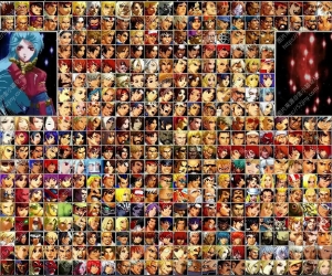 拳皇格斗游戏【MUGEN整合包下载】拳皇强凶43 人气#游戏下载
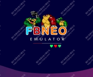 街机模拟器游戏ROM整合版 FinalBurn Neo (F118 人气#游戏下载
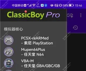 安卓游戏模拟器 ClassicBoy-Pro专业版N64 G622 人气#游戏下载
 FC游戏红白机档案典藏版 FC红白机游戏合集121 人气#游戏下载
 ㅤㅤ使用 MiSans SC 字体浙ICP备2022006091号-1


 提升卡
提升卡 置顶卡
置顶卡
